Search for answers or browse articles about Sintel Forms
Creating custom buttons using JavaScript
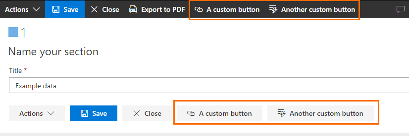
Using the logic feature, you can create your own custom buttons that will appear in a form and define their behaviour:

In order to achieve that, you need to use the addCustomButton() JavaScript function in one of the form’s logic rules. Here are some example calls of the function:
// Example A: button with a "Link" icon type, which link will be opened in the same tab as the form:
addCustomButton("A custom button", "Link", "https://www.some-web-address.com");

// Example B: button with a "SetAction" icon type, which link will be opened in a new tab:
addCustomButton("Another custom button", "SetAction", { url: "https://www.some-web-address.com", target: "_blank" });

// Example C: button with a "FavoriteStar" icon type, with a custom onClick code:
addCustomButton("Button with custom action", "FavoriteStar", function() { alert("Button has been clicked!") });
The addCustomButton() function accepts following parameters:
- label of the button
- icon type of the button. You can browse all available icon types on Microsoft’s Fluent UI icons page.
- behaviour of the onClick action:
- if it’s a string value, the page will be redirected to the provided string URL
- if it’s an {url, target } object, the page will be redirected to the string URL from the url property, using the target defined in the target property.
- if it’s a js function, it will simply be invoked on click
—
Using fully-custom js and css:
You can use the Logic feature to call custom JavaScript code that can manipulate the content of a form. This can be used to inject custom buttons into form’s layout.
You can download a form template containing the below example here.
Example: injecting a button into the toolbar
Step 1: creating a custom style for the button
In order to make sure that the button looks similar to other buttons, you can style it by creating a custom CSS in the Custom HTML property of any section in the form:
<style>
.custom-button{
	background-color: transparent;
	color:  #fff;
	font-size: 14px;
	font-weight: 600;
	cursor: pointer;
	height: 100\%;
	padding: 0 8px;
	display: flex;
	align-items: center;
}

.custom-button:hover {
	color:  #333333;
	background-color:  #EAEAEA;
}

.custom-button:active {
	background-color:  #C8C8C8;
}
</style>
This style is being applied to a “custom-button” CSS class, that we will have to apply to our button later.
Step 2: creating a custom button in JS code
We will create a new rule in the Logic section, and put a single “Execute custom js” step there, with the following code:
const customButtonId = "customButton1";

let buttonAlreadyExists = document.getElementById(customButtonId);

if (!buttonAlreadyExists) {

	let customButtonDiv = document.createElement("div");
	customButtonDiv.id = customButtonId;
	customButtonDiv.className = "custom-button";
	customButtonDiv.innerHTML = "I am a custom button.";

	const customButtonsRoot = document.getElementById("custom-buttons-root");

	customButtonsRoot.appendChild(customButtonDiv)

	customButtonDiv.onclick = () => {
		alert("The button has been clicked!");
	};

}
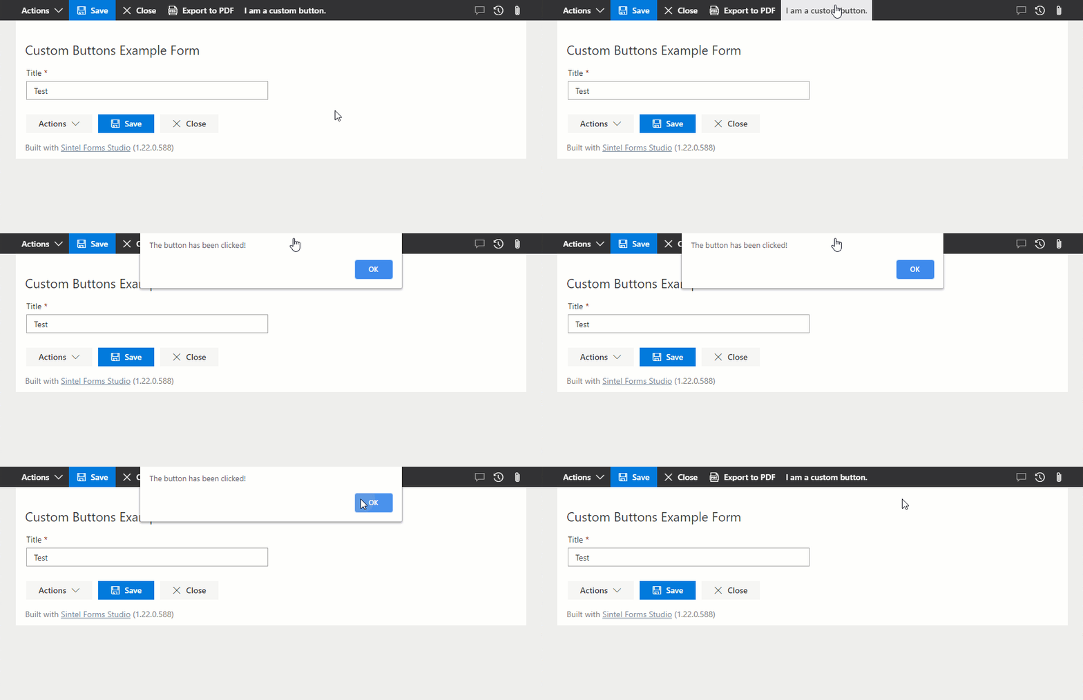
The code creates a new button and appends it to the “custom-buttons-root” HTML element, which is located right after all the toolbar buttons of the form.
Result:

