Search for answers or browse articles about Sintel Forms
Buttons
Adding buttons directly onto your forms is easily done by selecting them from the Widgets section within the Sintel Forms Designer. When you add a buttons widget you can add three types of buttons:
- Standard buttons such as Save, Close, and Export to PDF
- Workflow actions buttons based on any workflow actions you have defined
- Custom buttons that use your own code
Adding Standard Buttons
To add the buttons widget to the form you simply drag it from the Widgets section onto your form. Once you add it, the form is populated with a ‘Save‘ and a ‘Close‘ button by default. If you don’t want these buttons on your form you can simply hide them within the widget properties.
While you can add the widget into the form using any column layout, we recommend using a single-column layout to achieve the best display experience for your end-users.
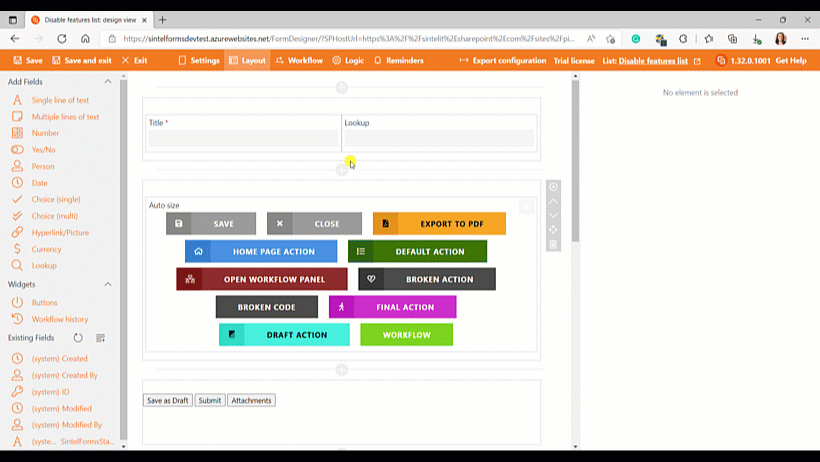
We recommend a single column layout when adding the buttons widget
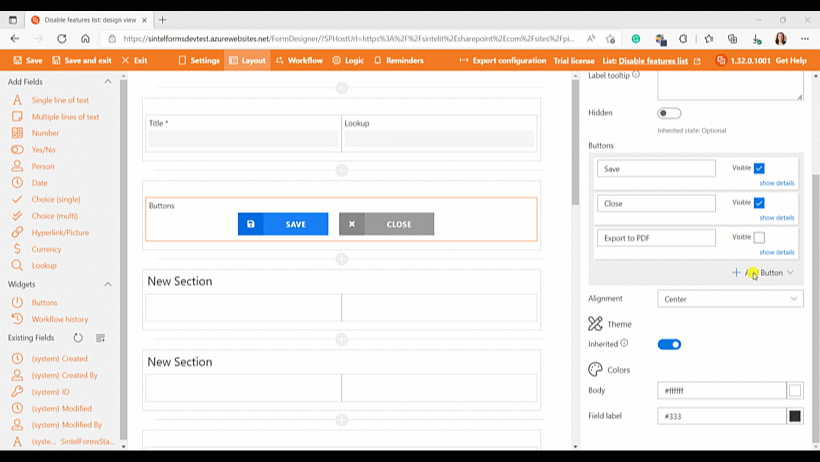
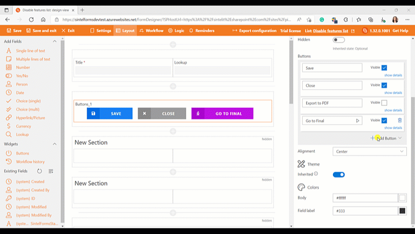
Settings
Once added the buttons widget has a number of settings that you can configure.
- You can change the name of the widget and if you wish you can label it and give the label a tooltip.
- You can choose to make the Save and Close buttons visible or hidden.
- Clicking ‘show details‘ will enable you to rename the buttons in addition to changing the text size, color, icon and width.
- You can optionally make the Export to PDF button visible.
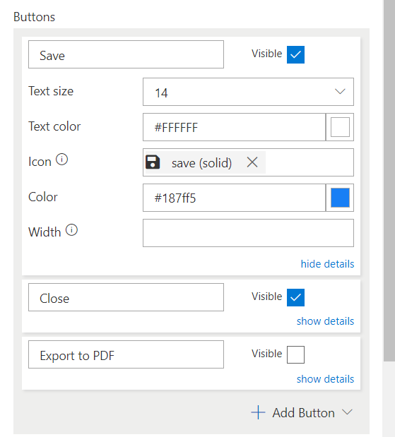
Configuring the look & feel settings on buttons
Adding Action Buttons
Adding an action button enables the user to execute any action you have defined in the Workflow screen.
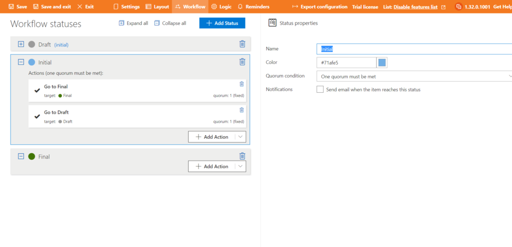
Actions defined in the Workflow screen
Once there are actions defined in the Workflow screen you can add Action buttons to your form
- Click ‘Add Button‘ and choose ‘Action Button‘.
- Click ‘show details‘ and give the button a name and change the sizing or colors etc…
- Finally, select the action you wish to execute.
Adding an Action Button
Adding Custom Buttons
Adding a custom button is a near-identical process to adding the action button apart from the fact you will need to add custom code.
In this example, we show how to add a button that enables the user to toggle open and close the Workflow panel on the right side of the form.
- Click ‘Add Button‘ and choose ‘Add Custom Button‘.
- Click ‘show details‘ and give the button a name and change the sizing or colors.
- Finally, add in your custom code.
Here are some examples using openPanel and togglePanel which can be used to open one of the right panels
- Using openPanel you can add a button that when clicked will open a specific panel, the user can then manually close the panel when they are finished with it.
- Using togglePanel you can add a button that when clicked will open a specific panel and when clicked on a second time will close the panel.
These will work with the following panels “conversations“, “workflow“, “attachments“, “external sharing”
openPanel("conversations");
openPanel("workflow");
openPanel("attachments");
openPanel("external sharing");
togglePanel("conversations");
togglePanel("workflow");
togglePanel("attachments");
togglePanel("external sharing");
Adding a Custom Button using togglePanel(“workflow”);
Open a link
window.open('https://www.google.com', '_blank');