Try it
  • Examples
  • Features
  • Testimonials
  • Partners
  • Pricing
  • Support
    • Sintel Apps Help
    • Sintel Apps Release History
    • Sintel BI Help
    • Sintel BI Release History
    • Webinars
    • How to video series
    • Ask the community
    • Submit a ticket
    • Request a demo
    • Compare us
  • Blog
  • Examples
  • Features
  • Testimonials
  • Partners
  • Pricing
  • Support
    • Sintel Apps Help
    • Sintel Apps Release History
    • Sintel BI Help
    • Sintel BI Release History
    • Webinars
    • How to video series
    • Ask the community
    • Submit a ticket
    • Request a demo
    • Compare us
    • For Schools
  • Blog
  • Get Started
How can we help?

Search for answers or browse articles about Sintel BI

Filter by categories Clear Results
  • Getting Started

    • What is Sintel BI
    • How to install Sintel BI
    • How to configure Sintel BI
    • How to use Sintel BI
    • How to install Sintel BI without AppSource
    • Sintel BI Best Practices
  • Data Sources

    • Data Sources
    • MS SQL
    • Excel
    • How to Merge Data Sources
  • Charts

    • Area Chart
    • Column Chart
    • Doughnut Chart
    • Line Chart
    • Pie Chart
    • Pyramid Chart
    • RAG area chart
    • RAG line chart
    • Spline Chart
    • Spline Area Chart
    • Stacked Column Chart
    • Stacked Line Chart
    • Step line chart
    • Polar Charts
    • Gauge Charts
  • Grids

    • Grid
    • Pivot Grid
    • Scheduler
  • Filters

    • Dashboard Level Filtering

      • User Filter
      • Multi-source dropdown filter
      • Dropdown Filter
      • Date Filter
      • Dashboard Override
    • Data Source Level Filtering

      • Data Source Filter
      • Dashboard Override
      • Dynamic Column
    • Filtering Guide: Understanding Your Options
  • General components

    • Image
    • Summary Card
    • Text
    • Maps
    • Kanban Board
    • Card
    • Custom HTML
    • Smart Card
    • Button
  • FAQs

    • Lists used by Sintel BI
    • Components Guide
    • Convert a Classic SharePoint site to a Modern Site
    • Permissions Required to Use Sintel BI
  • Troubleshooting

    • Cannot update the Sintel BI App
    • Cannot open Sintel Forms in a dialog
    • Blank screen when opening a dashboard
    • Warning when opening a dashboard
    • Error when attempting to view data in a data source
    • Error displaying data on a Dashboard
    • Cannot export an app due to outdated data sources
    • Cannot export an app due to error
    • How to remove or reinstall Sintel BI
    • Cannot Export a Sintel App Template due to long internal field names
    • Cannot share dashboards with AD groups
    • Warning SintelBISPSPrinciples does not exist
    • Sintel BI The Server Isnt Responding Temporary Fix And AppSource
  • Product Updates

    • Release History
    • How to update Sintel BI
  • Create App Templates

    • How to Import/Export a Sintel BI App
    • Sintel App Template Permissions
  • Settings

    • Navigation
    • The Sintel BI App Hub
  • Other

    • Web Parts
  • Advanced Features

    • Creating a Custom Landing Page in Sintel BI with CSS

Smart Card

Posted9 October 2024
Updated15 October 2024
ByAmy Dermody
You are here:
  • Main
  • General components
  • Smart Card
0 out of 5 stars
5 Stars 0%
4 Stars 0%
3 Stars 0%
2 Stars 0%
1 Stars 0%
< All Topics

The Smart Card component in Sintel BI allows users to present textual information alongside numerical data in a clear, engaging format. It is a flexible, visually appealing tool that enables you to highlight key figures and insights from your data.

This guide will walk you through the features, setup, and practical examples of how to use the Smart Card component effectively.

1. Adding the Smart Card

To add a Smart Card to your dashboard:

Drag and drop the Smart Card component onto your desired location in the dashboard.

Resize it to suit the space and design requirements.

2. Configuring the Smart Card

Once added, you can configure the following options from the properties panel on the right:

– Text Settings

Title: Add a title that summarises the purpose of the card (e.g., “Total Revenue”).

Subtitle: Provide an optional subtitle for additional context (e.g., “Q1 2024”).

Description: Add more detailed text if needed (e.g., “This card shows the total revenue generated in Q1”).

Icon: Choose an icon that represents the data visually (e.g., a money symbol for financial figures).

Title Alignment: Choose whether the title is left, centre, or right aligned.

– Link Settings

Link: You can make the Smart Card clickable by adding a URL. When a link is added, a small clickable icon will appear next to the title.

Link Description: Add a description for the link, providing users with context.

Open in New Tab: Select whether the link should open in a new tab or in the current tab.

– Security Settings

Visibility: You can configure who can see the Smart Card:

    • Public: Anyone can view the Smart Card.
    • Private: Restrict the card’s visibility and share it only with specific groups or users.

– Look and Feel Settings

Elevated Border: Add or remove an elevated border for visual emphasis.

Background Colour: Choose a background colour to make your card stand out.

Mobile Visibility: Select whether the Smart Card is visible on mobile devices.

Assigning Data to the Smart Card

Once you’ve configured the card’s appearance, you can assign data to it. Here’s how:

  1. Select a Data Source: Choose the relevant data source for the Smart Card.
  2. Select Text: You can use @ to insert dynamic data from numerical columns into the card’s text. For example, if you want to display total sales, use @sales in the description or title.
  3. Custom Code (Optional): If you’d like to add custom HTML you can s insert custom code.

3. Examples of Using the Smart Card

Here are some examples of how you might use the Smart Card in different scenarios:

– Sales Performance Overview

Display key sales metrics for a specific time period.

  • Title: “Total Sales”
  • Subtitle: “Q3 2024”
  • Description: “The total sales for this quarter have reached @TotalSales.”
  • Icon: ? chart-line-up (light)
  • Data: @TotalSales pulls in data from the “Sales” column.

Use Case: This is perfect for executive dashboards, where key figures need to be highlighted quickly.
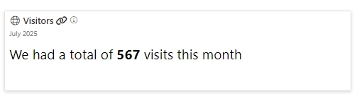
– Visitor Insights

Present your monthly  traffic figures.

  • Title: “Visitors”
  • Subtitle: “October 2024”
  • Description: “We had a total of @Visitors website visits this month.”
  • Icon: ? globe (light)
  • Link: Add a link to the detailed analytics report.

Use Case: This card could be used by marketing teams to track the effectiveness of campaigns and measure user engagement.
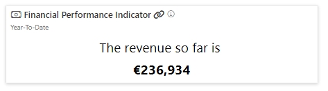
– Financial Performance Indicator

Show key financial figures like profit or revenue.

  • Title: “Total Revenue”
  • Subtitle: “Year-To-Date”
  • Description: “The revenue so far is @Revenue.”
  • Icon: ? money-bill (light)

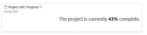
– Project Progress Report

Track the progress of a key project in your organisation.

  • Title: “Project ABC Progress”
  • Subtitle: “October 2024”
  • Description: “The project is currently @Completion% complete.”
  • Icon: ? calendar (light)


Was this article helpful?
0 out of 5 stars
5 Stars 0%
4 Stars 0%
3 Stars 0%
2 Stars 0%
1 Stars 0%
5
How can we improve this article?
Please submit the reason for your vote so that we can improve the article.
Table of Contents

Sintel Apps

Create apps on Microsoft 365 in minutes with no code.

Address

River House
Blackpool Park,
Cork, T23 R5TF,
Ireland

Support

  • Product help
  • Community site
  • Submit a ticket
  • Compare us

    Contact us to

    • Book a demo
    • Request a license
    • Become a partner

    e-mail: info@sintelapps.com
    tel: +353 (0) 21 245 2935

    Follow us

    • Follow
    • Follow
    • Follow

    © Copyright 2026 | End User License Agreement | Privacy Policy | Terms Of Use

    Sintel Apps
    Sintel Apps Assistant
    Get instant answers and support
    Connecting to Sintel Apps Assistant…
    Sintel is thinking…
    We use cookies to collect and analyse information about the users of this website. Please click 'I accept' to consent to the use of this technology.