Search for answers or browse articles about Sintel BI
Pie Chart
1. What is a Pie Chart?
A pie chart is a circular diagram that resembles a pie. Each of the ‘slices’ represents a category of data that makes up the whole.
The pie represents 100 per cent. The size of each ‘slice’ is relative to its portion of the whole. Pie charts can become overly complicated if there are too many categories of data being presented. A good pie chart should give information at a glance.
An example of a pie chart is given below, it shows the top marketing expenditures for a company.
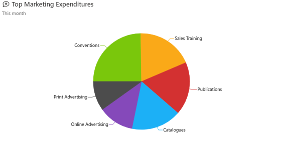
Pie Chart example
2. How to add and configure a pie chart.
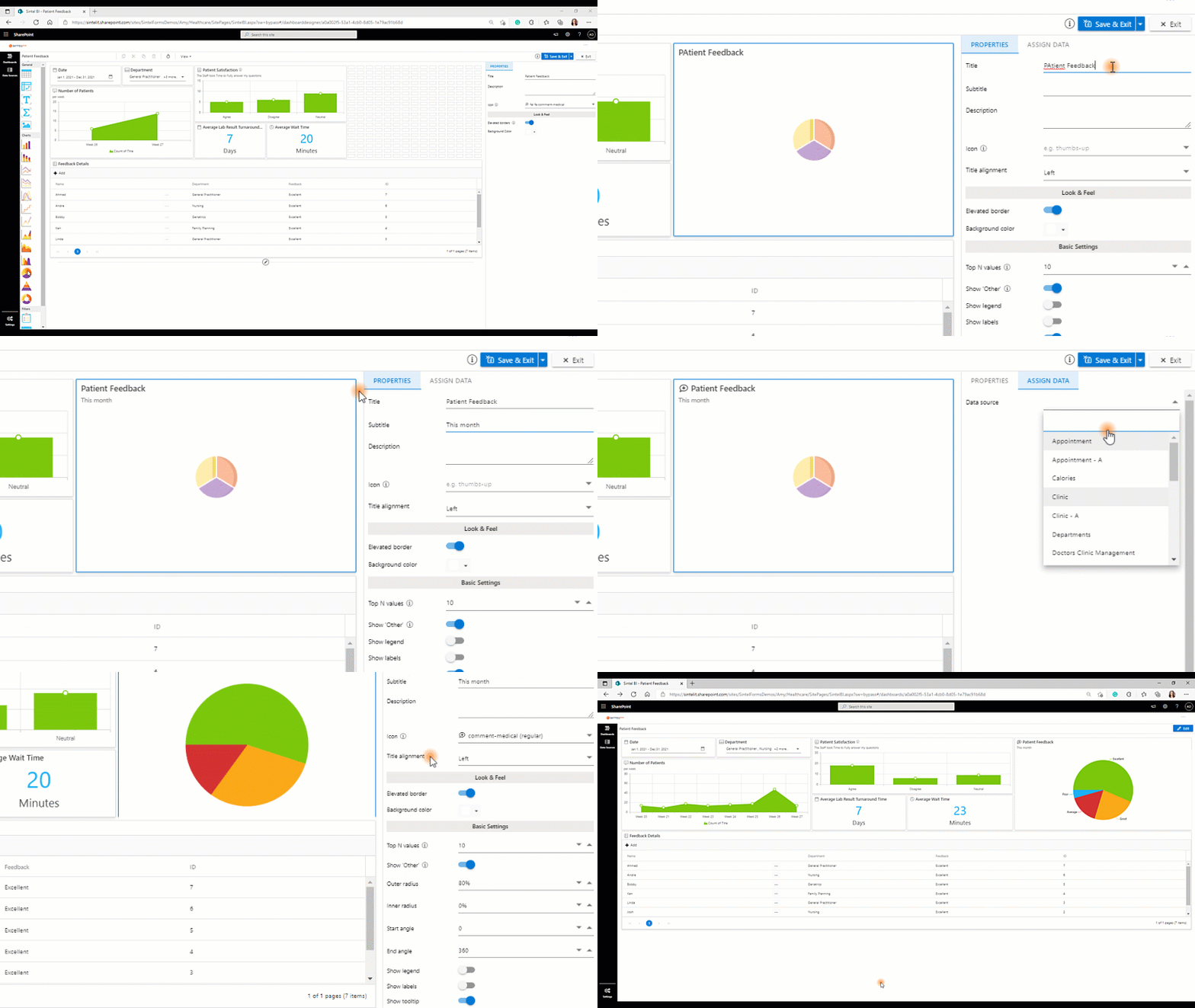
The following steps explain the data configuration of the bar chart:
- Drag and drop the pie chart icon from the toolbox into the design panel.
- Resize the widget as required.
- Select your chart and in the properties section, you can name the chart and change any settings you wish.
- You can then select assign data and select your data source.Please note that before adding a component you will need to define a data source.
- Drag and drop the relevant columns into the value, column and row section.

Adding and configuring the pie chart
3. Properties menu options
It is recommended that you check out the properties menu options to format your spline chart in the way that best suits the data you are depicting.
The following screenshots show the various properties menu options based on the column chart section.
Naming the Component
Naming the Component
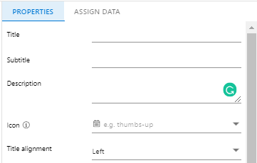
Title – This allows you to set a name for the component
Subtitle – This allows you to set a subtitle for the component.
Description – This allows you to show additional information in the form of a tooltip. It’s beneficial as it gives the user additional information without affecting the visualization.
Icon – Sintel Forms and Sintel BI both have Font Awesome embedded. This enables you to add
Title alignment – This determines the appearance and orientation of the component’s title. You can choose to align your text left, centre or right.
Look & Feel
Look & Feel
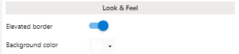
Elevated Border – You can switch the elevated border on and off of your component depending on what you like best.
Background Colour – You can change the background colour of the component to any colour you like. If you have specific brand guidelines you are adhering to you can paste in the HEX code directly.
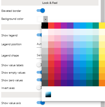
Select your background colour
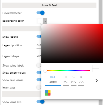
or paste in the HEX code directly to comply with brand guidelines
Basic Settings
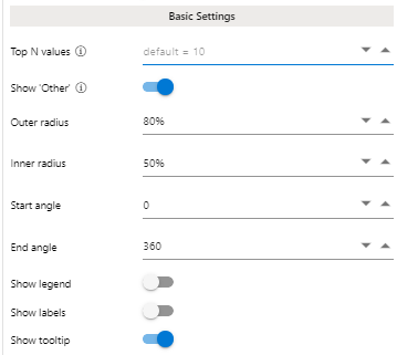
Basic Settings
Top N Values – By default, 1o items are shown, To remove the limit, enter 0.
Show ‘Other’ – You can show a single slice for all remaining values.
Outer Radius – You can change the size of the outer radius
Inner Radius – You can change the size of the inner radius
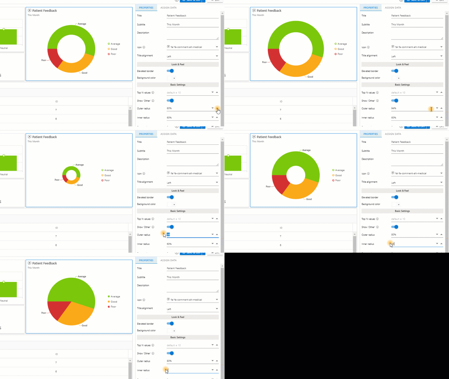
Changing the size of the inner and outer radius
Start Angle – Set the start angle
End Angle – Set the end angle
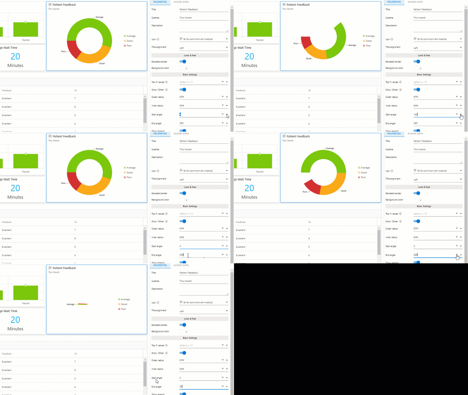
Changing the start & end angle
Show legend – A legend is an area of a chart describing each of the parts of the chart. You can switch on and off the visibility of the legend.
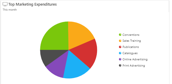
Show legend
Legend position – You can choose the position in which the legend appears in relation to the chart. The options are Auto, Top, Left, Bottom and Right.
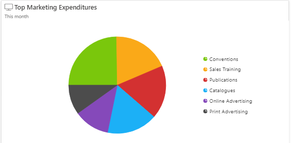
legend positioned to the right
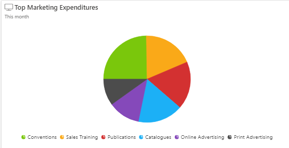
Legend positioned on the bottom
Legend shape – You can choose the shape of the bullet points of the legend. Your options are SeriesType (Which mimics the kind of chart you have added), Circle, Pentagon, Triangle and Rectangle,
Show labels – You can switch on and off the visibility of the value labels for each individual column.
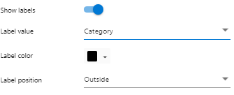
Label Value – You can decide whether the label displayed is a category, value or a custom value.
If you decide on having a custom value there are a number of tags supported: {category}, {value} , {percentageValue}, {percentageValue1}. {percentageValue2} and {total}.
For the example, below we chose to display the % ({percentageValue}) of the marketing expenditure.
Label Colour – If you choose for the labels to become visible you can also choose the colour of those labels.
Label Position – You can choose to display your labels inside or outside the pie chart.
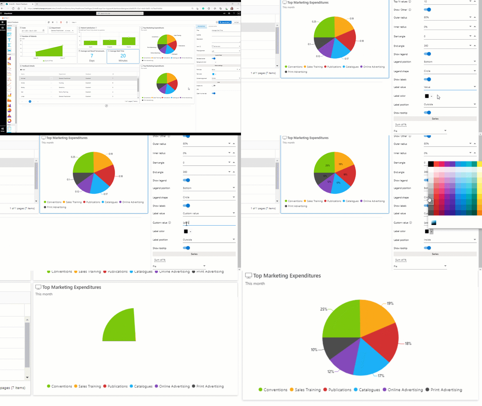
Changing the label value, position and colour.
Series
Within the series section, you can change the title that appears at the bottom of your chart, you can change the colour of your chart and you can also change the chart type.
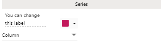
Series section of the properties pane
Once you have added your pie chart component and assigned data to it, make sure you save your work.
If you liked this article and would like to learn more about other components, click here.
To learn more about Sintel check our features or testimonials.
If you would like to learn more about Sintel Forms or Sintel BI book a no-obligation demo.
For the latest updates follow us on LinkedIn/Twitter & YouTube.