Search for answers or browse articles about Sintel BI
Grid
A grid component can display a table with data in your dashboard.
When adding a grid you will need a minimum of one column on your table. It is also possible to add a column but hide it from view on your dashboard. That means the data won’t be visible on your dashboard but it can be used for filtering other components on the dashboard.
Step 1 Add the Grid Component
- Drag and drop the Grid icon from the container on the left of your dashboard when in design view.
- Adjust the grid according to the required size.
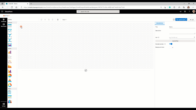
Adding and Resizing Grid
Step 2 Naming the Component
- If you select the empty grid component it will open the properties pane on the right-hand side. I always like to start by naming my new component and giving it a description and an icon.
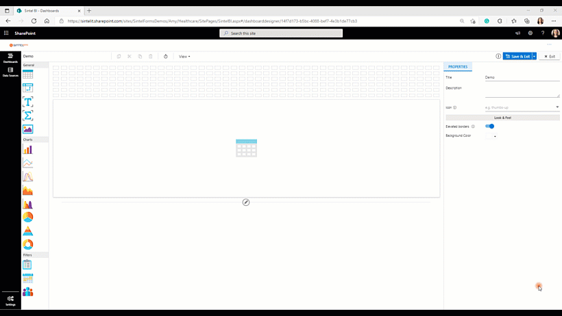
Naming the grid and giving it an icon.
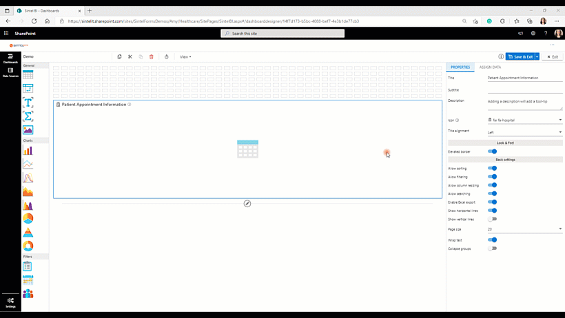
Step 3 Properties Pane – Look & Feel and Basic Settings
- On the properties pane, you can turn on and off many different settings.
To get the hang of these basic settings my recommendation is to assign data to your grid, go back to the basic settings tab and turn on and off the individual options to get a better idea of how they will impact your grid.
| Setting | Description | Enabled by Default |
| Allow Sorting | You can control the sorting of columns in grid control. | No |
| Allow Filtering | This allows you to enable a filter box for each column in the grid for easy filtering of data. | No |
| Allow Column Resizing | This enables you to widen or shorten the width of any column on a grid. | No |
| Allow Searching | Search for an element featured within a grid for example a persons name or date. | No |
| Enable Excel Export | Enabling this allows you to export the data of the grids view to (.xlsx or .xls) format. | No |
| Show Horizontal Lines | You can enable or disable horizontal grid lines in the grid control. | Yes |
| Show Vertical lines | You can enable or disable vertical grid lines in the grid control. | No |
| Choose Page Size | By default, the Page Size value will be set as 20. You decide the page size based on your requirements. | N/A |
| Allow Text Wrapping | This allows you to wrap the text if the text length is high. | No |
|
Group Collapsable |
This enables you to collapse groups so one can choose to view only the relevant | No |
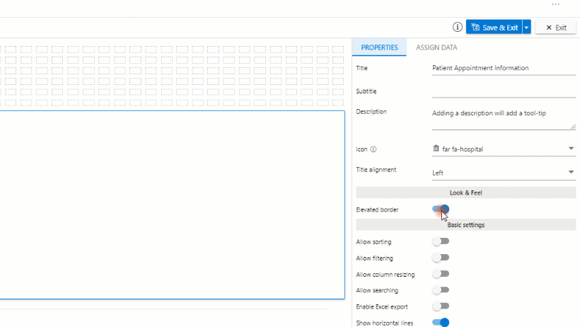
Properties Pane – Look & Feel and Basic Settings
Step 4 Assign the data to the Component
- From the properties pane, you can select Assign Data.
- Here you can select your Data Source. If you are trying to select a data source, but there are no options to select, check out this article which shows you how to define a data source.
Step 5 Organise the Data
- Under visible columns, each column from your data source will be imported to your grid. If you wish to remove any of these columns, simply click the ‘x‘ button. It is advisable not to have too many columns in your grid to avoid a cluttered screen.
- It is possible to reorganise the data by dragging and dropping the data in the order your wish it to appear.
- You can also rename any column by selecting the settings icon beside the column name. For example, in the sample, I renamed the column ‘date’ to ‘date of appointment’
- If you wish you can then sort or group your grids. For example, you can sort the information by name, or you group your data based on status. Again, it is advisable that you play around with these options on your own dashboard to get a feel for them.
Assigning and Organising the Data
| Option within Column Settings | Description |
| Header Text | Allows you to change the columns header from that which was imported. |
| Text Align | You can choose where in the column a text will appear: Left, Right, Center or Justify. Justify means the text will be arranged such that the left and right ends of all lines within paragraphs are aligned. |
| Width | You can choose the minimum width of a column. It is set as 120px as default. |
|
Show as: Value/RAG |
The show as the setting will be set to ‘Value’ as default. However, you can also choose to show the column value with Red, Amber or Green colours assigned to the value. See the images below. |
| Show as: Pill |
This feature enables you to colour cells within a grid based on the value. The option enables you to apply a specific colour to the background depending on the value. You can also add an icon to be displayed depending on the set value.
You also have the ability to import values from the Sintel Forms Status column and in doing so the Sintel Forms Status values and colours are auto-imported. See video below for tutorial on how to use this feature. |
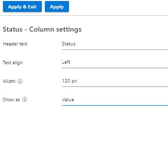
Column settings with Show as ‘Value’
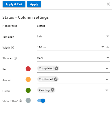
Column settings with Show as ‘RAG’
Show as: Pill (Colour cells within a grid based on the value)
This feature enables you to colour cells within a grid based on the value. The option enables you to apply a specific colour to the background depending on the value. You can also add an icon to be displayed depending on the set value. You also have the ability to import values from the Sintel Forms Status column and in doing so the Sintel Forms Status values and colours are auto-imported.
Once you have added your grid component and assigned data to it, make sure you save your work.
If you liked this article and would like to learn more about other components, click here.
To learn more about Sintel check our features or testimonials.
If you want to learn more about Sintel Forms or Sintel BI book a no-obligation demo.
For the latest updates follow us on LinkedIn/Twitter & YouTube.