Search for answers or browse articles about Sintel BI
Maps
With our map component, you can visualise your data in new ways, such as the number of sales by country or the number of leads or support tickets.
The following steps show you how to add a map to a dashboard:
- To add a map drag and drop the map tile onto your dashboard designer.
- Within the properties, you can give the map a title, subtitle, description and icon.
- Under look and feel you can add an elevated border and decide whether to show or hide the map on mobile.
- In basic settings, you can allow zooming, labels and tooltips. Here you can also choose the map type.
There are currently two map types available on Sintel BI:
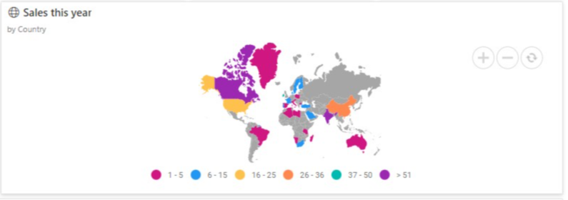
Choropleth Map
i. Choropleth – Permits the user to show quantitative values based on a colour scale.
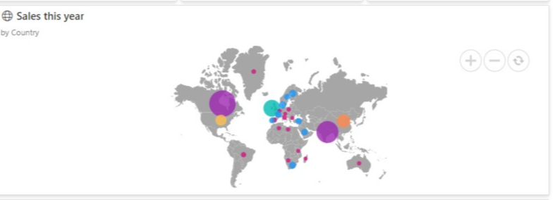
Bubble Map
ii. Bubble – This enables the user to visualise quantitative values using different-sized bubbles on a map. - The next step is to Assign Data. First, you select your data source, you can then add the columns you wish to be displayed.
- Once you have added your map component and assigned data to it, make sure you save your work.
If you liked this article and would like to learn more about other components, click here.
To learn more about Sintel check our features or testimonials.
If you would like to learn more about Sintel Forms or Sintel BI book a no-obligation demo.
For the latest updates follow us on LinkedIn/Twitter & YouTube.