
Try it
  • Examples
  • Features
  • Testimonials
  • Partners
  • Pricing
  • Support
    • Sintel Apps Help
    • Sintel Apps Release History
    • Sintel BI Help
    • Sintel BI Release History
    • Webinars
    • How to video series
    • Ask the community
    • Submit a ticket
    • Request a demo
    • Compare us
  • Blog
  • Examples
  • Features
  • Testimonials
  • Partners
  • Pricing
  • Support
    • Sintel Apps Help
    • Sintel Apps Release History
    • Sintel BI Help
    • Sintel BI Release History
    • Webinars
    • How to video series
    • Ask the community
    • Submit a ticket
    • Request a demo
    • Compare us
    • For Schools
  • Blog
  • Get Started
How can we help?

Search for answers or browse articles about Sintel BI

Filter by categories Clear Results
  • Getting Started

    • What is Sintel BI
    • How to install Sintel BI
    • How to configure Sintel BI
    • How to use Sintel BI
    • How to install Sintel BI without AppSource
    • Sintel BI Best Practices
  • Data Sources

    • Data Sources
    • MS SQL
    • Excel
    • How to Merge Data Sources
  • Charts

    • Area Chart
    • Column Chart
    • Doughnut Chart
    • Line Chart
    • Pie Chart
    • Pyramid Chart
    • RAG area chart
    • RAG line chart
    • Spline Chart
    • Spline Area Chart
    • Stacked Column Chart
    • Stacked Line Chart
    • Step line chart
    • Polar Charts
    • Gauge Charts
  • Grids

    • Grid
    • Pivot Grid
    • Scheduler
  • Filters

    • Dashboard Level Filtering

      • User Filter
      • Multi-source dropdown filter
      • Dropdown Filter
      • Date Filter
      • Dashboard Override
    • Data Source Level Filtering

      • Data Source Filter
      • Dashboard Override
      • Dynamic Column
    • Filtering Guide: Understanding Your Options
  • General components

    • Image
    • Summary Card
    • Text
    • Maps
    • Kanban Board
    • Card
    • Custom HTML
    • Smart Card
    • Button
  • FAQs

    • Lists used by Sintel BI
    • Components Guide
    • Convert a Classic SharePoint site to a Modern Site
    • Permissions Required to Use Sintel BI
  • Troubleshooting

    • Cannot update the Sintel BI App
    • Cannot open Sintel Forms in a dialog
    • Blank screen when opening a dashboard
    • Warning when opening a dashboard
    • Error when attempting to view data in a data source
    • Error displaying data on a Dashboard
    • Cannot export an app due to outdated data sources
    • Cannot export an app due to error
    • How to remove or reinstall Sintel BI
    • Cannot Export a Sintel App Template due to long internal field names
    • Cannot share dashboards with AD groups
    • Warning SintelBISPSPrinciples does not exist
    • Sintel BI The Server Isnt Responding Temporary Fix And AppSource
  • Product Updates

    • Release History
    • How to update Sintel BI
  • Create App Templates

    • How to Import/Export a Sintel BI App
    • Sintel App Template Permissions
  • Settings

    • Navigation
    • The Sintel BI App Hub
  • Other

    • Web Parts
  • Advanced Features

    • Creating a Custom Landing Page in Sintel BI with CSS

Polar Charts

Posted20 June 2024
Updated20 June 2024
ByAmy Dermody
You are here:
  • Main
  • Charts
  • Polar Charts
5 out of 5 stars

1 rating

5 Stars 100%
4 Stars 0%
3 Stars 0%
2 Stars 0%
1 Stars 0%
< All Topics

Polar charts  are a type of data visualisation that displays data in a circular format, where each category is represented by a segment radiating from the centre. This format is useful for showing multivariate data and identifying patterns and trends in a radial layout.

How to Use Polar Charts

Step 1: Add the Polar Chart to Your Dashboard

  1. Edit Mode: Ensure your dashboard is in edit mode.
  2. Drag and Drop: Drag a polar chart onto your dashboard.
  3. Resize: Adjust the chart size as needed.

Step 2: Configure Chart Properties

  1. Title: Enter a title for your chart.
  2. Subtitle: Add a subtitle if needed.
  3. Icon: Choose an icon that represents the data.
  4. Title Alignment: Set the title alignment to left, centre, or right.

Step 3: Customise Appearance

  1. Elevated Borders: Enable elevated borders for a 3D effect.
  2. Background Colour: Change the background colour to suit your dashboard’s theme.
  3. Mobile Visibility: Choose to hide the chart on mobile devices if necessary.

Step 4: Basic Settings

  1. Show Legend: Display the legend.
  2. Show Value Labels: Show labels for each value.
  3. Show Empty Values: Choose to display empty values.
  4. Show Zero Values: Display zero values.
  5. Invert Axes: Invert the chart axes if needed.

Step 5: Axis Settings

  1. Value Axis: Enable or disable the value axis.
  2. Axis Title: Provide a title for the value axis.
  3. Axis Min/Max: Set minimum and maximum values for the axis.
  4. Axis Type: Choose between Double, Logarithmic, or Category.
  5. Smart Labels: Enable smart labels to abbreviate numeric axis labels.
  6. Category Axis: Show or hide the category axis.
  7. Category Axis Title: Provide a title for the category axis.
  8. Axis Label Rotation: Rotate axis labels for better readability.
  9. Tooltip: Show or shorten tooltip values for additional information on hover.

Step 6: Assign Data

  1. Data Source: Select the data source for the chart.
  2. Assign Columns: Drag columns into the value, column, and row fields.
  3. Sort and Series Settings: Configure sorting and series settings based on your data source.

Examples of Polar Chart Usage

Example 1: Employee Skill Distribution
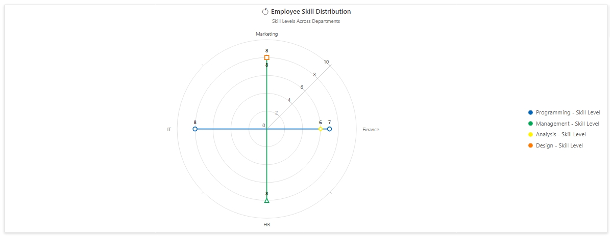
Objective: Visualise the skill levels of employees across different departments.

Data Source: SharePoint List called “Employee Skills”

Column Name Column Type Description
Employee Name Single line of text Name of the employee
Skill Choice Skill name (e.g., Programming, Design)
Department Choice Department (e.g., IT, Marketing)
Skill Level Number Level of skill proficiency (1-10)

Example Data:

Employee Name Skill Department Skill Level
John Doe Programming IT 8
Jane Doe Design Marketing 7
Oscar Dunnes Design Marketing 8
Marge Connors Programming IT 7
Louise Thompson Analysis Finance 6
Amy Berry Management HR 7.5
Lily O’Brien Management Marketing 8
Ross Anure Programming Finance 7


Polar Chart Configuration:

Properties:

  • Title: Employee Skill Distribution
  • Subtitle: Skill Levels Across Departments
  • Icon: Suitable icon for skills
  • Title Alignment: Centre

Appearance:

  • Elevated Borders: Enabled
  • Background Colour: None
  • Hide on Mobile: No

Basic Settings:

  • Show Legend: Enabled
  • Legend Position: Right
  • Legend Shape: Circle
  • Show Value Labels: Enabled
  • Shorten Value Labels: Enabled
  • Show Empty Values: Disabled
  • Show Zero Values: Disabled
  • Invert Axes: No

Axis Settings:

  • Show Value Axis: Enabled
  • Start Angle: 45
  • Show Smart Labels: Enabled
  • Show Category Axis: Enabled
  • Category Axis Title: Department
  • Axis Label Rotation: 45 degrees
  • Show Tooltip: Enabled
  • Shorten Tooltip Values: No

Assign Data:

  • Data Source: Employee Skills
  • Value: Skill Level (Average of Skill Level)
  • Column: Department
  • Row: Skill
Tip: Add a dropdown filter to filter by employee name

Conclusion

Polar charts in Sintel BI offer a robust way to visualise multivariate data in a radial format. By customising the chart’s properties and assigning relevant data, users can create informative and visually appealing dashboards that highlight patterns and trends effectively. Whether you’re displaying employee skills, sales performance, or customer satisfaction survey results, polar charts can enhance your data presentation and provide deeper insights.

Was this article helpful?
5 out of 5 stars

1 rating

5 Stars 100%
4 Stars 0%
3 Stars 0%
2 Stars 0%
1 Stars 0%
5
How can we improve this article?
Please submit the reason for your vote so that we can improve the article.
Table of Contents

Sintel Apps

Create apps on Microsoft 365 in minutes with no code.

Address

River House
Blackpool Park,
Cork, T23 R5TF,
Ireland

Support

  • Product help
  • Community site
  • Submit a ticket
  • Compare us

    Contact us to

    • Book a demo
    • Request a license
    • Become a partner

    e-mail: info@sintelapps.com
    tel: +353 (0) 21 245 2935

    Follow us

    • Follow
    • Follow
    • Follow

    © Copyright 2026 | End User License Agreement | Privacy Policy | Terms Of Use

    Sintel Apps
    Sintel Apps Assistant
    Get instant answers and support
    Connecting to Sintel Apps Assistant…
    Sintel is thinking…
    We use cookies to collect and analyse information about the users of this website. Please click 'I accept' to consent to the use of this technology.