Search for answers or browse articles about Sintel BI
Card
What are Card Components?
Card components in Sintel BI are versatile, customisable elements used to display information in a concise, visually appealing format. Each card can encapsulate various data points, making them ideal for summarising information, displaying details, and enhancing the overall user interface of your dashboards.
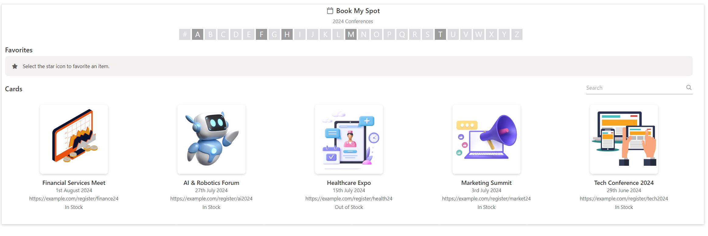
How to Use Card Components
Step 1: Select a Data Source
Choose the data source you want to display in the card component. This can be a SharePoint list, database, or any other data source compatible with Sintel BI.
Step 2: Configure Card Properties
- Title: Map to the main identifier of your data (e.g., Product Name, Event Name).
- Subtitle: Map to a secondary identifier (e.g., by month, by category etc.).
- Description: Provide a brief description from your data.
- Icon: Choose an icon that represents the content or category.
- Title Alignment: Set the alignment of the title as per your preference.
- Allow Searching, Filtering, Favouriting: Enable these options as needed.
- Change Title and Image Size: Adjust the sizes for better readability and presentation.
- Custom HTML: Add any custom HTML for additional styling or functionality.
Step 3: Assign Data
- Select a Data Source: Link your card component to the chosen data source.
- Give It a Title: Use the relevant field from your data source for the title.
- Select Where the Image Comes From: Specify the field containing the image URL.
- Give an Icon: Assign a static or dynamic icon based on the content. (Should you assign an image and an icon to a tile, the image assigned will be the one displayed on the card tile)
- Tool Tip: Provide a tooltip for additional context on hover (Add a single line of text column to your SharePoint list called tooltip, and add the tooltips there for each card tile)
- Additional Text Levels and Links: Map other relevant fields for further details.
Examples of Card Component Usage
Example 1: Employee Directory Dashboard
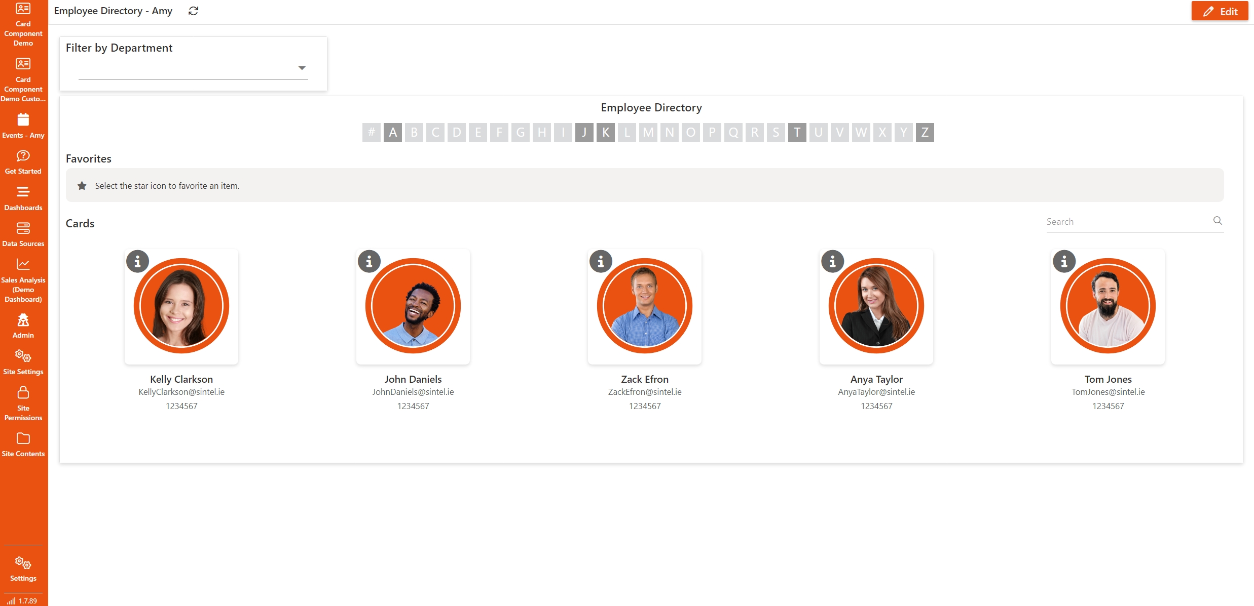
Objective: Create an employee directory with details such as name, role, contact information, and profile picture.
Data Source: SharePoint List called Employee Information
| Column Name | Column Type | Description |
|---|---|---|
| Name | Single line of text | Full name of the employee |
| Role | Single line of text | Job title or role |
| Department | Choice | Department the employee belongs to |
| Single line of text | Email address | |
| Phone | Single line of text | Phone number |
| Profile Picture | Hyperlink or Picture | URL to the employee’s profile picture |
| Bio | Multiple lines of text | Brief biography of the employee |
Example Data
| Name | Role | Department | Phone | Profile Picture | Bio | |
|---|---|---|---|---|---|---|
| John Doe | Software Engineer | IT | john.doe@example.com | 555-1234 | https://example.com/images/john_doe.jpg | Experienced software engineer specialising in... |
| Jane Smith | Marketing Manager | Marketing | jane.smith@example.com | 555-5678 | https://example.com/images/jane_smith.jpg | Marketing expert with over 10 years of... |
Card Configuration
Properties
- Title: Employee Directory
- Allow Searching, Filtering, Favouriting: Enabled
- Tile Size: Extra Large
- Change Image Size: 100%
- Custom HTML: If you wish you could have custom styling for card layout
Assign Data
- Data Source: Employee Information
- Title: Name
- Image: Image URL should like to employee headshot
- Text 1: Role
- Text 2: E-mail
- Text 3: Phone
- Link: You could link to full employee profile
Example 2: Event Management Dashboard
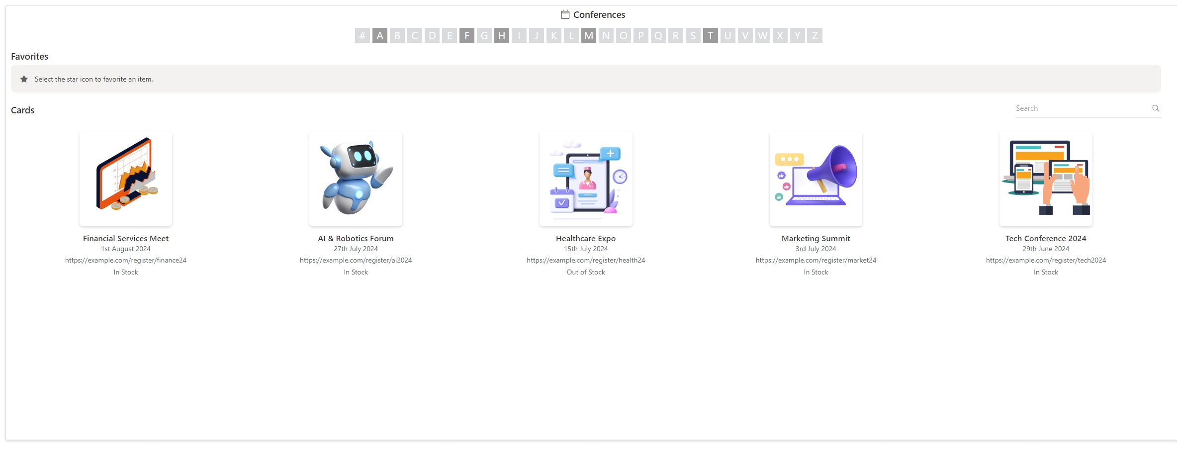
Objective: Display details of upcoming events, including name, date, location, and registration link.
Data Source: SharePoint List called “Event Management”
| Column Name | Column Type | Description |
|---|---|---|
| Event Name | Single line of text | Name of the event |
| Event Date | Single line of text | Date of the event |
| Location | Single line of text | Location of the event |
| Description | Multiple lines of text | Brief description of the event |
| Image URL | X | URL to the event image |
| Organiser | Single line of text | Name of the event organiser |
| Registration Link | Hyperlink | URL to the event registration page |
Example Data:
| Event Name | Event Date | Location | Description | Image URL | Organiser | Registration Link |
|---|---|---|---|---|---|---|
| Tech Conference 2024 | 25 June 2024 | San Francisco, CA | Join industry leaders and tech enthusiasts... | https://example.com/images/tech_conference.jpg | John Doe | https://example.com/register/tech2024 |
| Marketing Summit | 15 July 2024 | New York, NY | Discover the latest trends in marketing... | https://example.com/images/marketing_summit.jpg | Jane Smith | https://example.com/register/market24 |
Properties:
- Title: Event Management
- Allow Searching, Filtering, Favouriting: Enabled
- Tile Size: Extra Large
- Change Image Size: 100%
- Custom HTML: Optional for custom styling
Assign Data:
- Data Source: Event Management
- Title: Event Name
- Image: Image URL (link to event image)
- Text 1: Event Date
- Text 2: Location
- Text 3: Organiser
- Link: Registration Link
Conclusion
Card components in Sintel BI are a powerful way to display summarised information visually and interactively. By leveraging their customisable properties and integrating with your data sources, you can create informative, user-friendly dashboards tailored to various use cases, from employee directories to product catalogues and event management systems. Start experimenting with card components today to enhance your Sintel BI dashboards and improve data presentation and user experience.