Search for answers or browse articles about Sintel BI
Gauge Charts
Gauge charts are valuable tools for conveying information. In this guide, we’ll delve into how to utilise the Gauge chart component in Sintel BI, explore its functionalities, and provide examples of its practical applications.
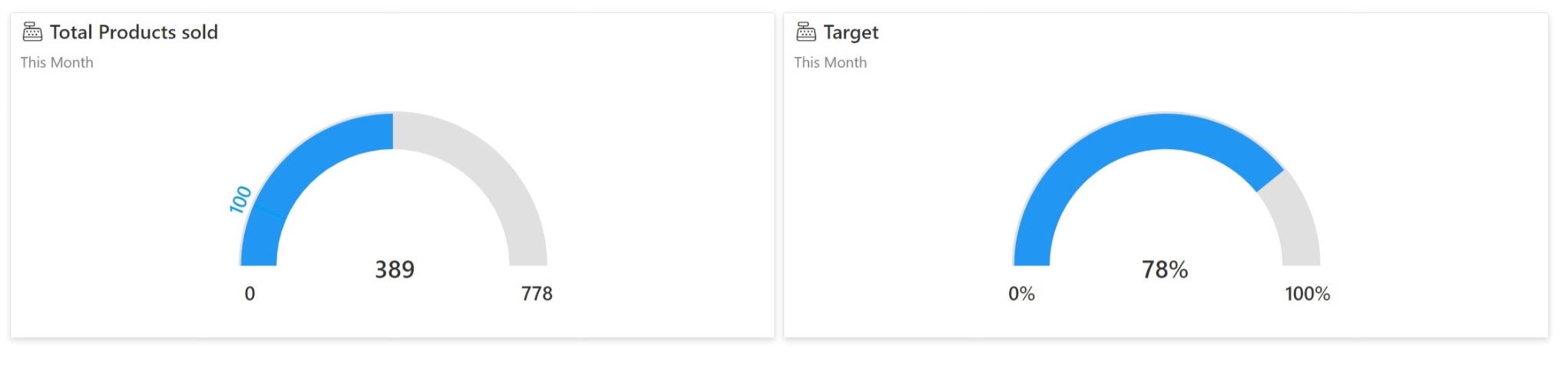
Adding Gauge Charts to Your Dashboard
Accessing the Gauge Component:
- Navigate to the dashboard editor in Sintel BI, create a new dashboard or edit an existing one.
- Within the Charts section, locate the Gauge component, found at the end of the list.
Assigning Data Source:
- After adding the Gauge component to your dashboard canvas, assign a data source.
- Choose the dataset containing the relevant metrics you wish to visualise with the Gauge chart.
Setting the Value Field:
- Set the Value field in the Gauge chart. This determines the primary metric displayed.
- If only the Value field is selected, the Gauge range is calculated as <0, 2 * Value>, filling it to approximately 50%.

Customising Min, Max, and Target:
- Optionally, customise the minimum (Min), maximum (Max), and target (Target) values.
- These properties can be populated with field values from your dataset or set as static numeric values by toggling the slider to ‘Static’. You can customise one, two, or all of these properties in a single Gauge chart.
Aggregate Functions:
- When setting the Value, Min, Max, or Target, choose from various aggregate functions such as Sum, Count, Average, Unique Count, Max, or Min.
Visual Settings Customisation:
- Utilise the Visual Settings sidebar to customise the appearance of the Gauge chart.
- Choose between presenting the value as a numeric value or a percentage.
- Adjust the colours to indicate whether the current value is below or above the target, enhancing visual clarity.
Practical Applications of Gauge Charts
Performance Metrics Monitoring:
Ideal for tracking metrics like sales targets, production output, or customer satisfaction scores.
Progress Tracking:
Track progress towards goals or milestones, providing stakeholders with a clear visual representation.
Resource Utilisation Analysis:
Visualise resource utilisation metrics such as server capacity or inventory levels.
Quality Control Assessment:
Effective for monitoring quality control metrics such as defect rates or adherence to quality standards.
Financial Indicators Analysis:
Visualise financial indicators such as budget adherence or revenue forecasts.
Customising Min, Max, and Target
You can customise the minimum (Min), maximum (Max), and target (Target) values of the Gauge. These properties can be populated with field values from your dataset or set as static numeric values by toggling the slider to ‘Static’.
Here’s a breakdown of how you might approach customising these properties:
Customising Min, Max, and Target Individually:
- Min: You might customise the minimum value of the Gauge chart if you want to ensure that the Gauge starts at a specific point on the scale, rather than always starting from zero. For example, if you’re visualising temperatures and you know that the lowest possible temperature is -10°C, you could set the minimum value to -10.
- Max: Similarly, you might customise the maximum value of the Gauge chart if you want to cap the upper limit of the scale. For instance, if you’re tracking scores on a test and you know that the highest possible score is 100, you could set the maximum value to 100.
- Target: The target value represents a specific goal or threshold that you want to visualise on the Gauge chart. For example, if you’re monitoring sales performance and you have a target sales figure for the month, you could set the target value to that figure.
Combining Customisations
- Depending on your use case, you may choose to customise one, two, or all three of these properties in a single Gauge chart. For instance, you might customise the minimum and maximum values to define a specific range for the Gauge, while also setting a target value to highlight a desired performance goal.
Dynamic vs. Static Values:
- You can populate these properties with field values from your dataset, allowing the Gauge chart to dynamically adjust based on the data. Alternatively, you can set static numeric values by toggling the slider to ‘Static‘, providing a fixed reference point for comparison.
- Dynamic Properties: Using field values from your dataset for Min, Max, and Target properties is beneficial when you want the Gauge chart to reflect real-time changes in your data. For instance, if your sales targets vary each month or quarter, dynamically updating these properties ensures that the Gauge chart accurately represents the current targets.
- Static Properties: Setting static numeric values is useful when you have predefined targets or thresholds that do not change frequently. For example, if your company has set fixed sales targets for the year, you can input these targets as static values in the Gauge chart to provide a consistent benchmark for performance evaluation.
Aggregate Functions
When setting the Value, Min, Max, or Target, you have the flexibility to choose from various aggregate functions such as Sum, Count, Average, Unique Count, Max, or Min.
Sum: This function calculates the total sum of all values in the selected field. For example, if you’re visualising sales data and you choose the “Sum” function for the “Value” property, the Gauge chart will display the total sum of sales.
Count: The “Count” function counts the number of non-empty values in the selected field. It’s useful for scenarios where you want to count the occurrences of certain events or items.
Average: With the “Average” function, the Gauge chart calculates the arithmetic mean of all values in the selected field. This indicates the typical or average value of the metric being visualised.
Unique Count: The “Unique Count” function calculates the number of unique values in the selected field. It helps identify the distinct elements within a dataset.
Max: This function determines the maximum value in the selected field. It’s useful for highlighting the highest value achieved for a particular metric.
Min: Conversely, the “Min” function identifies the minimum value in the selected field. It’s valuable for showcasing the lowest recorded value for a given metric.
Application:
In a sales dashboard, users might choose the “Sum” function for the “Value” property to display the total sales revenue. Alternatively, they could opt for the “Average” function to show the average sales per day over a certain period.
Similarly, in a quality control dashboard, the “Min” function could be used to highlight the lowest defect rate recorded, while the “Max” function could indicate the highest quality score achieved.