Search for answers or browse articles about Sintel BI
Button
The Button component allows you to add buttons to your other dashboards enhancing the user experience by making navigation between dashboards seamless and intuitive.
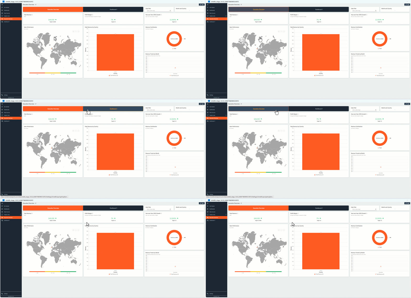
How to add the ButtonComponent
1. Adding the Component
Navigate to the Components Panel in your Sintel BI project.
Drag and drop the “Button” component into your desired dashboard layout.
2. Configuring Security Settings
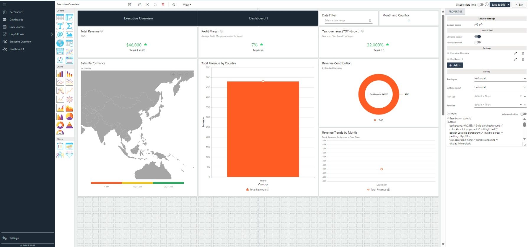
You can configure who has access to the component:
Public Access: Make the component available to all users.
Restricted Access: You can set specific security settings to control who can view and interact with the component.
3. Customising the Look and Feel
Elevated Border: Add a subtle border around the component to make it stand out.
Hide on Mobile: If the navigation isn’t necessary on smaller screens, you can opt to hide the component on mobile devices.
4. Adding Buttons to Your Navigation
Click the + button to add a new item.
You canthen choose between two options:
- Dashboard Link: Select the dashboard you want the button to link to.
- External Link: Enter a URL to direct users to an external website or resource.
Select the Dashboard you want the button to link to.
Enter a title for the button.
Optionally, choose an icon from the Font Awesome icon library. You can browse and select icons based on your preferences.
5. Editing and Deleting Buttons
Each button can be edited or removed:
To edit a button, click the pencil icon. This allows you to change the title, dashboard link, or icon.
To delete a button, click the trash icon next to the button you want to remove.
6. Styling
The Button component includes a Styling Section to fine-tune the appearance of your buttons:
- Text layout: Choose between presenting text horizontally or vertically.
- Button Layout: Choose between presenting buttons horizontally or vertically.
- Icon Size: Adjust the size of the button icons.
- Text Size: Set the text size for the button labels.
- Custom CSS: As before, you can apply custom CSS to further personalise the button styles (see the example below).
7. Customising Button Styles with CSS
Custom CSS for Tabbed Navigation
If you prefer a tailored look for your buttons, you can apply custom CSS. Here’s an example of a CSS snippet you can use:
/* Base button styles */
.button {
    background: #1c2833; /* Solid dark background */
    color: #bdc3c7 !important; /* Soft light text */
    border: 2px solid transparent; /* Invisible border */
    padding: 12px 20px;
    text-decoration: none; /* Remove underline */
    display: inline-block;
    font-size: 18px;
    font-weight: 600;
    text-align: center;
    position: relative; /* Needed for animation positioning */
    overflow: hidden; /* Prevent overflow during animations */
    transition: background 0.3s ease, color 0.3s ease; /* Smooth button transitions */
    cursor: pointer;
}

/* Hover effects */
.button:hover {
    background: #34495e; /* Highlighted hover background */
    color: #f39c12 !important; /* Bright hover text */
    border-color: #f39c12; /* Highlight border */
}

/* Active button styles */
.button.active {
    background: #ff5c23;
    color: #ffffff !important;
    border-color: #ff5c23;
    font-weight: 700;
}

/* Text Animation: Initial State */
.button .textWrapper .text {
    position: relative;
    display: inline-block;
    transition: transform 0.3s ease, color 0.3s ease; /* Smooth animations for text */
    z-index: 1; /* Ensure it's above any pseudo-elements */
}

/* Text Animation on Hover */
.button:hover .textWrapper .text {
    transform: translateY(-2px); /* Slight upward shift on hover */
    color: #f39c12 !important; /* Change text color on hover */
}

/* Cool underline effect for text */
.button .textWrapper .text::after {
    content: '';
    position: absolute;
    left: 0;
    bottom: -2px; /* Just below the text */
    width: 100%;
    height: 2px;
    background: #f39c12; /* Highlight color for underline */
    transform: scaleX(0); /* Hidden by default */
    transform-origin: right;
    transition: transform 0.3s ease; /* Smooth scaling effect */
}

/* Reveal underline on hover */
.button:hover .textWrapper .text::after {
    transform: scaleX(1); /* Fully visible */
    transform-origin: left; /* Expands from left to right */
}
Conclusion
The Button component has an easy-to-use interface, security options, and customisable styling, making it simple to create an intuitive, seamless experience for your users.
If you have any questions or need further assistance, please contact our support team!