Search for answers or browse articles about Sintel BI
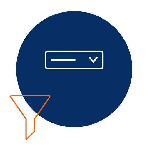
Dropdown Filter
1. What is a Dropdown Filter?
Dropdown Filters in Sintel BI allow users to filter data based on predefined options from a column within a list. This is particularly useful for selecting specific categories such as departments, product types, or other classifications.
For example, a Dropdown Filter can be used to filter feedback details by department, ensuring users can focus on relevant data.
2. How to Add and Configure a Dropdown Filter
⚠️ Important Pre-requisite
For a Dropdown Filter to function correctly, other components or charts on your dashboard must use the same data source. For example, if filtering by department, the associated data grid must contain department-related data.
– Assigning the Dropdown Filter
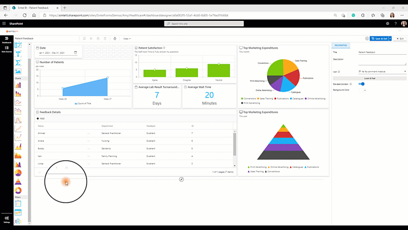
- Drag and drop the Dropdown Filter icon from the toolbox into the design panel.
- Resize the widget as required.
- Select the newly added Dropdown Filter and open the Properties panel.
- Assign a name and configure any necessary settings.
- Click Assign Data and select your data source.
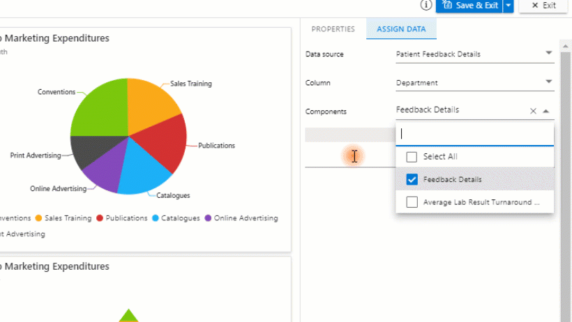
– Assigning Data to the Dropdown Filter
- Define a data source before adding the Dropdown Filter component.
- Select the data source and choose the relevant column containing the data to filter (e.g., ‘Department’ column from ‘Patient Feedback Details’).
- Select components to be influenced by the filter. The selected components must contain the same data for the filter to be effective.
- Set a default value:
- Select a single value (e.g., one department).
- Select multiple values (e.g., several departments).
- Select all values (showing all available data by default).
- Click Save to apply the configuration.
3. Properties Menu Options
The Dropdown Filter includes several configuration options accessible from the Properties menu:
– Title & Appearance
- Title – Set a name for the component.
- Subtitle – Add a subtitle for clarity.
- Description – Display additional information in a tooltip.
- Icon – Use Font Awesome icons to enhance visual representation.
- Title Alignment – Adjust text alignment (Left, Centre, or Right).
– Look & Feel
- Elevated Border – Toggle on/off to customise appearance.
– Basic Settings
- Read-Only Mode – When enabled, users can only view data within the default selection and cannot modify the filter.
– Example Use Case: Read-Only Filtering
If a default value is set to show only Geriatrics department feedback, enabling Read-Only Mode ensures that users cannot view feedback related to other departments.
After configuring and assigning data to your Dropdown Filter, ensure you save your work to retain the changes.
Adding the dropdown filter component
Setting Default Value
Learn More
If you found this guide helpful and want to explore other components, click here.
- Discover more about Sintel BI features or testimonials.
- Interested in Sintel Forms or Sintel BI? book a no-obligation demo.
- Stay updated by following us on LinkedIn/Twitter & YouTube.