Search for answers or browse articles about Sintel Apps
Layout Tab (Overview)
This article explains the Layout tab in the Sintel Apps Designer and how it is used to design the structure, content, and appearance of Smart Forms.
The Layout tab focuses entirely on what users see and interact with when completing a form.
What the Layout Tab Is For
The Layout tab is used to:
- Design the visual layout of a form
- Add and organise fields and widgets
- Group content into sections or tabs
- Configure field properties and styling
It does not control logic, workflows, or form behaviour beyond layout and presentation.
Layout Tab Screen Structure
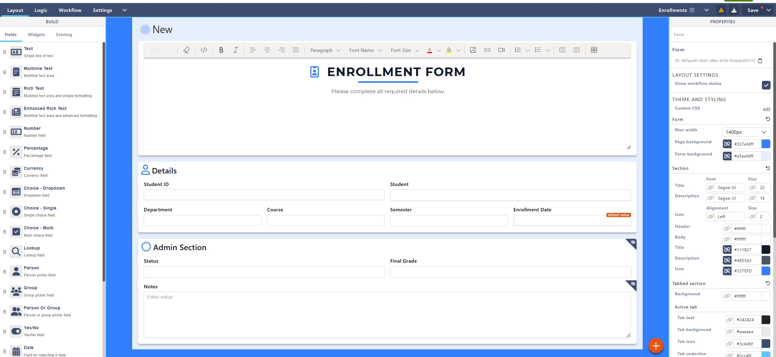
The Layout tab is divided into three main areas:
- Left Panel – Fields, widgets, and existing columns
- Centre Canvas – The form layout
- Right Panel – Properties and styling
Understanding these three areas is key to working efficiently in the designer.
Left Panel – Build Tools
The left-hand panel contains everything you can add to the form.
It is split into three tabs:
- Fields
- Widgets
- Existing
– Fields
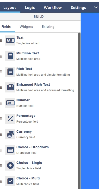
The Fields tab contains standard input fields used to collect data.
Common field types include:
- Text (single line, multi-line)
- Number, Percentage, Currency
- Choice (dropdown, single choice, multi-choice)
- Lookup
- Person
- Date and Time
- Yes/No
- Hyperlink
- Picture
When a field is added:
- A corresponding column is created in the underlying SharePoint list
- The field can be configured using the Properties panel
– Widgets
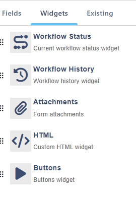
The Widgets tab contains functional and informational components.
Common widgets include:
- Attachments
- Buttons
- Workflow Status
- Workflow History
- HTML (custom content)
Widgets enhance usability and interaction but do not always store data in the list.
– Existing
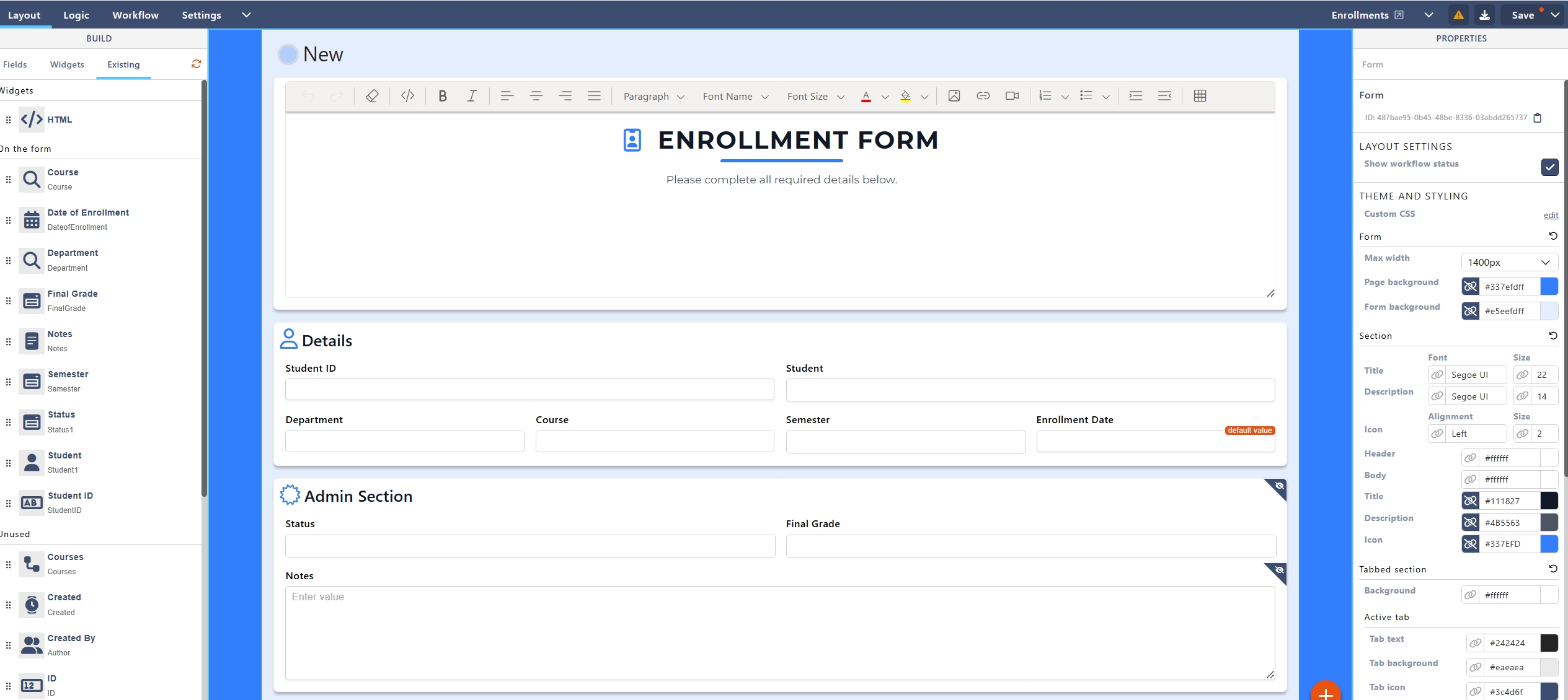
The Existing tab displays columns that already exist in the underlying SharePoint list.
This includes:
- Title
- Created
- Created By
- Modified
- Modified By
- ID
These fields can be dragged onto the form and positioned as required.
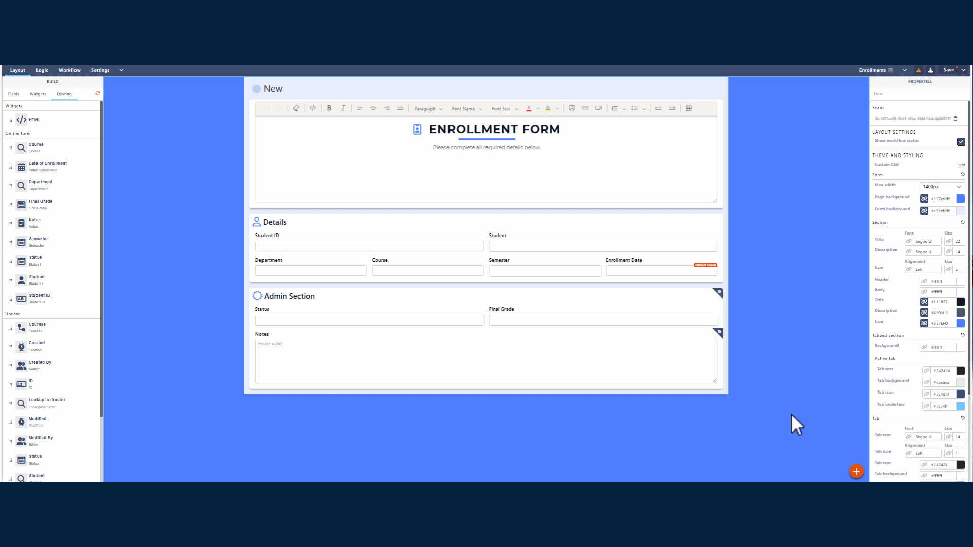
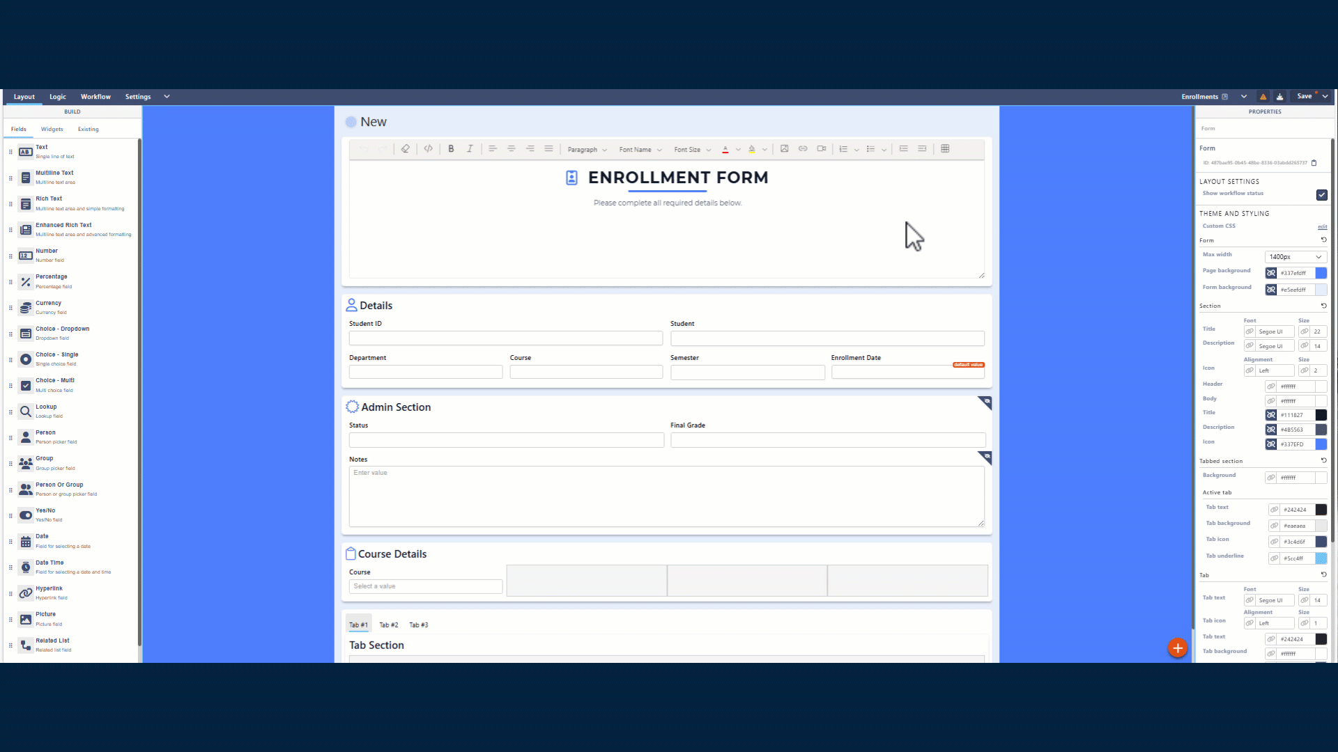
Centre Canvas – Form Layout Area
The centre canvas is where the form is visually constructed.
Key Characteristics
- Drag-and-drop layout
- Live preview of form structure
- Section-based organisation
All fields and widgets must be placed inside a section.
– Sections
Sections are containers used to group related fields.
Default Section
When a form is created, a default section (e.g. Section #1) is added automatically.
What Sections Are Used For
- Structuring the form
- Improving readability
- Applying logic at group level
- Styling form areas consistently
Sections can be:
- Renamed
- Styled
- Shown or hidden using Logic rules
– Adding Sections and Tabs
Using the Add (+) button on the canvas, you can add:
- Section
Adds a new vertical section to the form - Tabbed Section
Creates a tabbed layout for grouping large forms into logical steps
Tabbed sections are recommended for:
- Long or complex forms
- Multi-stage data entry
- Improving user experience
– Drag-and-Drop Behaviour
The Layout tab supports intuitive drag-and-drop interactions:
- Fields can be reordered within a section
- Fields can be moved between sections
- Widgets can be placed alongside fields
- Existing list columns can be added at any time
Changes are visual only until the form is saved.
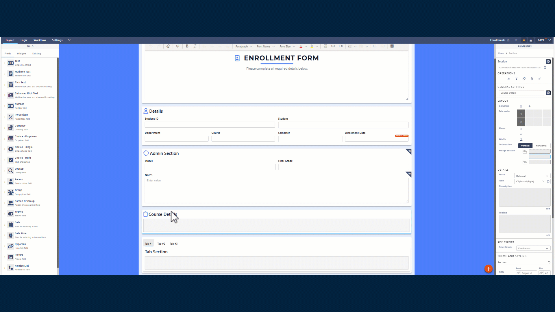
Right Panel – Properties
The Properties panel changes dynamically depending on what is selected on the canvas.
You can configure properties for:
- The form
- Sections
- Tabs
- Individual fields
- Widgets
– Form Properties
When the form itself is selected, you can configure:
- Maximum form width
- Page background colour
- Form background colour
- Global styling options
- Custom CSS
These settings affect the entire forms theme.
– Section Properties
When a section is selected, available options include:
- Adding Containers to your section to hold your different fields.
- Section title and description
- Font type and size
- Text alignment
- Header and body colours
- Icon configuration
These settings apply only to the selected section.
– Field Properties
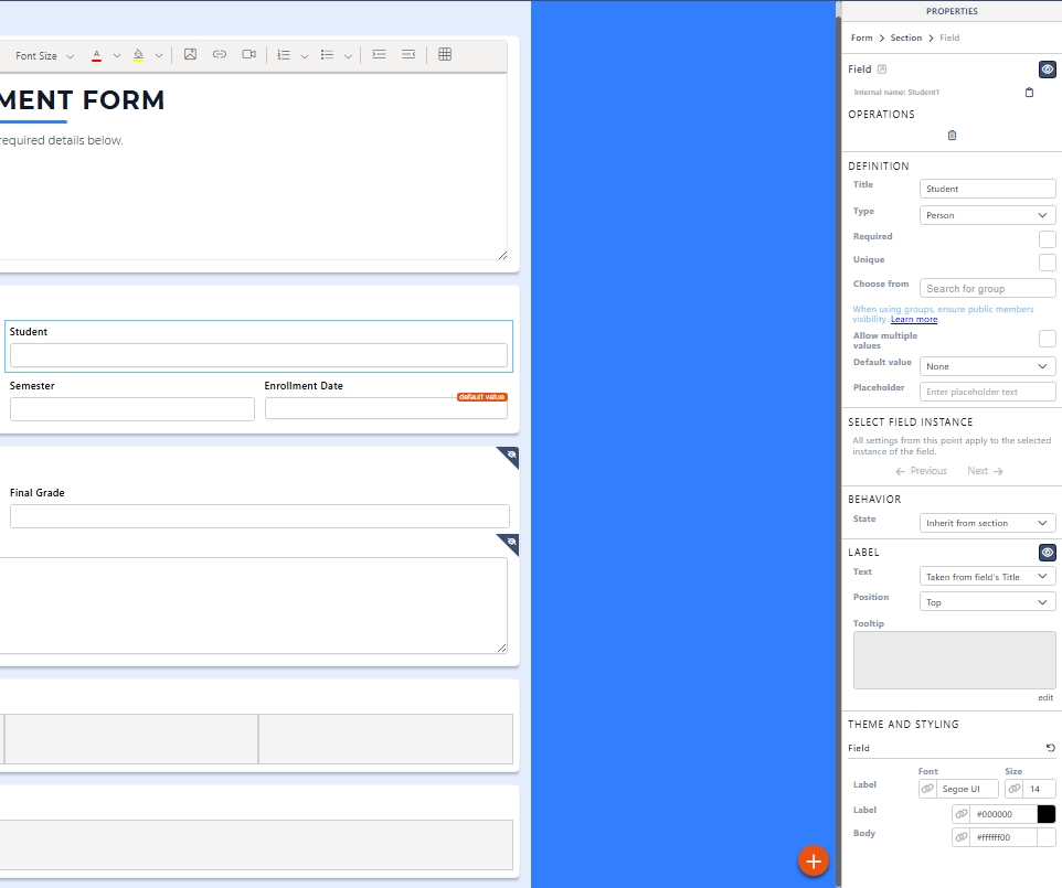
When a field is selected, you can configure:
- Label text
- Help text
- Placeholder values
- Required state
- Default values
- Visibility and read-only state
- Validation messages
- Styling options
These properties vary depending on the field type.
Field behaviour can later be extended using the Logic tab.
Best Practices for Layout Design
- Group related fields into clear sections
- Use tabbed sections for long forms
- Avoid overcrowding sections
- Keep labels short and descriptive
- Design layout before adding complex logic
A well-designed layout reduces the need for complex rules later.
Key Things to Know
- Fields added here create or bind to SharePoint columns
- All content must exist inside a section
- Styling is optional but improves usability
- Layout changes do not affect workflow or logic directly
What’s Next?
➡️ Next article: Sintel Apps Designer – Logic Tab (Rules and Conditions)
This guide explains how to make forms dynamic using conditions and actions.