


In this post, I will show how to enhance the display of Tab controls within Sintel Forms using CSS.
Note: The examples shown were inspired by Tab Styles Inspiration.
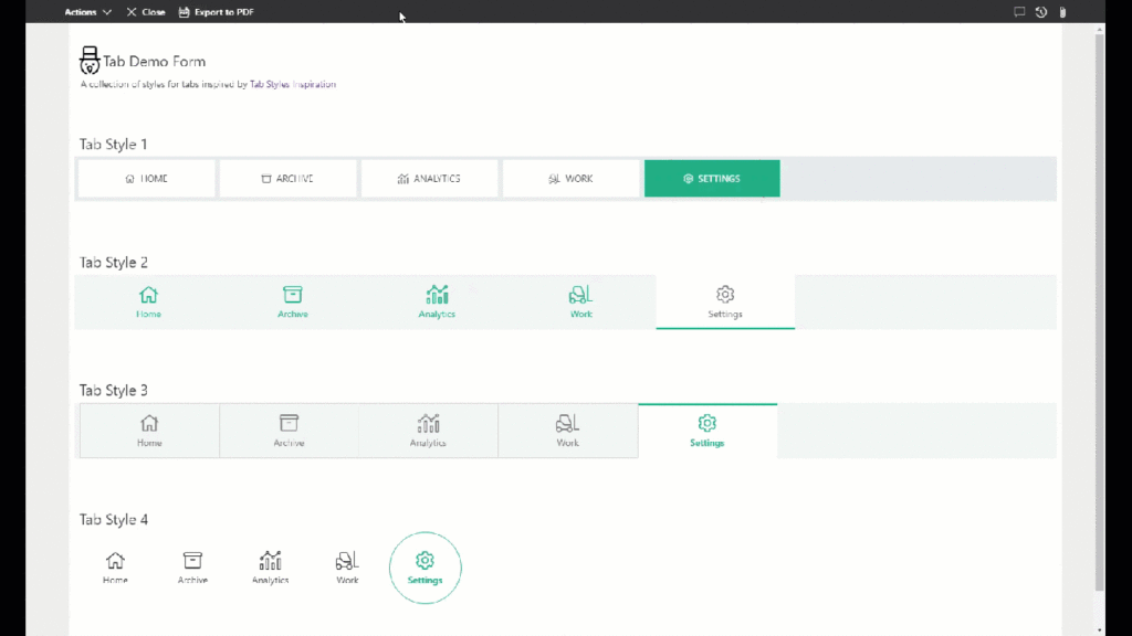
4 tab styling options
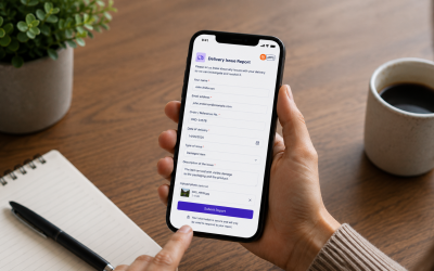
If you want to try out the sample above from within our SharePoint tenant click here.
Note: This is made possible thanks to our External Submissions feature which enables anonymous users to create and edit forms without having access to a tenant.
How to create these tabs
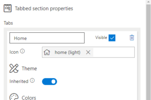
- In Sintel Forms Designer add a Tab Section on your form.
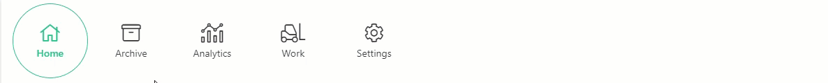
- Add required tabs and define icons for each tab, as per the image below.
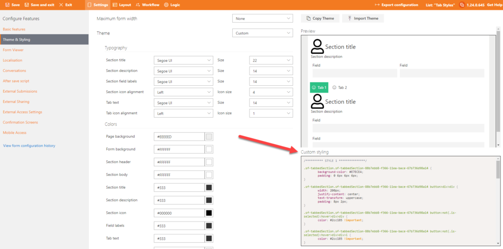
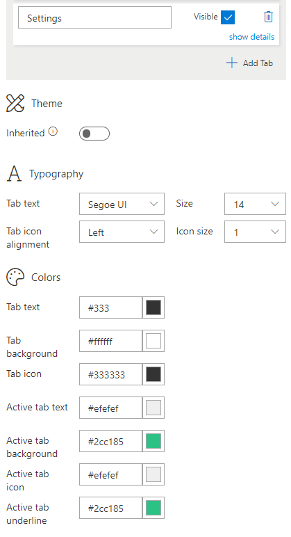
- Configure Tab Theme. Use values from one of the Tab Styles below.
- Navigate to Settings -> Theme & Styling and paste custom CSS into the “Custom Styling” editor.
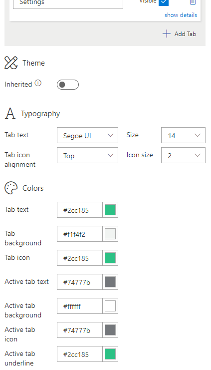
Tab Style 1

Tab Theme:
CSS:
.sf-tabbedSection div.ms-Pivot {
    background-color: #E7ECEA;
    padding: 6px;
}
.sf-tabbedSection button>div>div {
    width: 200px;
    text-transform: uppercase;
    padding: 8px 2px;
}
.sf-tabbedSection button:not(.is-selected):hover>div>div {
    color: #2cc185 !important;
}
.sf-tabbedSection button:not(.is-selected):hover>div>div>i {
    color: #2cc185 !important;
}
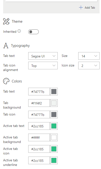
Tab Style 2

Tab Theme:
CSS:
.sf-tabbedSection div.ms-Pivot {
    background-color: #F1F4F2;
    padding: 0 8px;
}
.sf-tabbedSection button>div>div {
    width: 200px;
    justify-content: center;
    padding: 8px 4px;
}
.sf-tabbedSection button.is-selected:before {
    left: 0 !important;
    right: 0 !important;
    border-bottom-width: 3px;
}
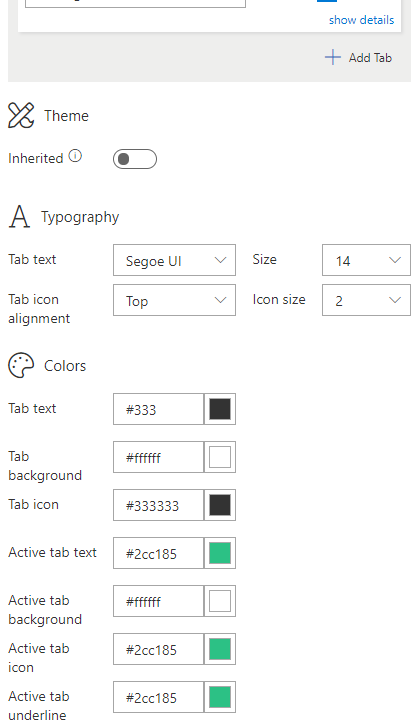
Tab Style 3

Tab Theme:
CSS:
.sf-tabbedSection div.ms-Pivot {
    background-color: #F1F4F2;
    padding: 1px 8px 0 8px;
}
.sf-tabbedSection button {
    margin: 0;
    border: 1px #D3D8D6 solid;
        margin-top: -1px;
        margin-right: -1px;
}
.sf-tabbedSection button.is-selected {
    border-bottom-color: #FFF;
}
.sf-tabbedSection button>div>div {
    width: 200px;
    justify-content: center;
    padding: 8px 4px;
}
.sf-tabbedSection button.is-selected:before {
    left: 0 !important;
    right: 0 !important;
    border-bottom-width: 3px;
    bottom: unset;
}
.sf-tabbedSection button:not(.is-selected):hover>div>div {
    color: #2cc185 !important;
}
.sf-tabbedSection button:not(.is-selected):hover>div>div>i {
    color: #2cc185 !important;
}
Tab Style 4
Tab Theme:
CSS:
.sf-tabbedSection div.ms-Pivot {
    padding: 0 8px;
}
.sf-tabbedSection button>div>div {
    width: 100px;
    height: 100px;
    justify-content: center;
    padding: 4px;
}
.sf-tabbedSection button.is-selected:before {
    left: 0 !important;
    right: 0 !important;
    top: 0 !important;
    bottom: 0 !important;
    height: unset;
    border: 1px solid rgb(44, 193, 133);
        border-radius: 50%;
}
If you are interested in trying this form or designing your own form the first step is to install Sintel Forms Studio into your Office 365 tenant, get it from AppSource.

Download This Form Template
For the latest updates follow us on LinkedIn/Twitter/YouTube.


0 Comments